About the new Citi AAdvantage credit card design
 On Sunday morning I wrote about Citi redesigning the AAdvantage credit cards. That same day I called up Citibank and told them that I wanted the new redesigned credit card. It’s the only credit card that I ever use.
The representative I spoke to was very helpful and more than willing to do this for me. The representative, who was located in Jacksonville, Florida, sent me the replacement card overnight. I received it last night (Tuesday).
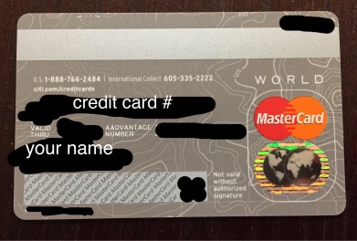
Here are some of the changes: (image below)
- The new card is not embossed. As in the letters and numbers are not raised. It’s all one flat surface. (TD Bank and Capital one have a few cards this way)
- The MasterCard logo is in the back of the card.
- I assume that the Visa and American Express logo will also appear in the back in due time.
- The AAdvantage number is in the back of the card.
- The credit card number is in the back of the card.
- Expiration date, signature panel and security code are in the back of the card.
- Your full name appears in the front and in the back of the card.
I like the new design better than the old vintage look. However, I like my cards old-fashioned, as in, the name and credit card number in the front embossed.
Have you received the card with the new design?
*UPDATE: I don’t have the Citi AAdvantage Executive credit card because I always buy Admirals Club for way cheaper than $450, however, you can see how the new card looks on Travel with Grant’s blog. The new Citi AA Executive card does not have the Admirals Club logo on the back.


Thanks for the heads up. I just requested the new card design for my Citi AA Exec card. Should have FedEx deliver it tomorrow morning. 🙂
This is the new trend across many banks. My latest United Chase card is just like this as well.
I like the non-embossed design. It makes it easier to stack several cards together flush.Takes up less space in the wallet.